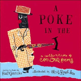

A Poke in the I: A Collection of Concrete Poems
What's This Book About
Even kids who don’t know they like poetry will love this playful, visually accessible collection of thirty concrete poems—illustrated by a Caldecott Honor artist! Concrete poems startle and delight the eye and mind. The size and arrangement of words—or even just letters on the page can add or alter meaning, and poems can take the shape of crows and fly off the page. Or become a balloon filled with rhyme drifting away from outstretched hands. Or fourteen exuberant lines can become “Joy Sonnet in a Random Universe.” Here in a single extraordinary volume are thirty poems from some of the world’s finest visual poets, including John Hollander, Emmett Williams, Maureen W. Armour, and Douglas Florian—a spirited “poke in the I” brought to you by the very talented Paul B. Janeczko and Chris Raschka.
What Kind of Book is A Poke in the I: A Collection of Concrete Poems
Topics
Genres
Reviews
Book Lists That Include This Book
The Creatives Behind the Book
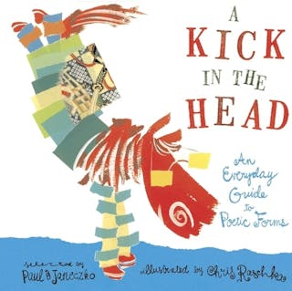
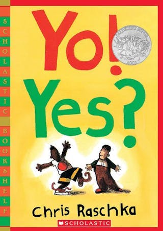
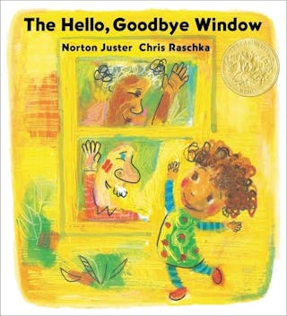
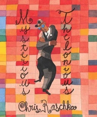
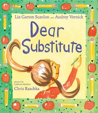
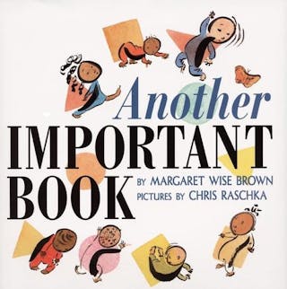
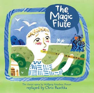
I’m sometimes asked about my general approach to illustration, which has over the years come to be described as minimal. Hmm, I’m not sure minimal is such a complimentary term, but I’ll accept it. I wasn’t always minimal. In the early days I was laying it on as thickly as I could, trying very hard to get it right. But I found that the harder I tried, the more tired whatever it was I was working on looked. And then I grew tired of it as well. “There is too much sweat in it,” is how my friend, the artist Vladimir Radunsky, would put it. Perhaps he means that there has been an imposition of too much of my will upon the material with which I was working. It is an offhand remark of Wordsworth’s that helped me when I needed a new way to move forward: “The matter always comes out of the manner.” How you say something has direct bearing on what you say. So, if you labor heavily upon a work of art, then part of what you are saying is, this is a heavy work of art. If you happen to be trying to say something about lightness, then the art should be light as well. It is much the same with food. There are heavy meals and light meals. There are sauces that contain endless lists of ingredients, and there are sauces that contain only a few but in exquisite proportion. Does an apple taste best bitten directly into, sliced thinly with a light squeeze of lemon, or baked for an hour with nutmeg, sugar, cinnamon, flour and egg whites? Maybe the answer is that there is a time for all of those things. My answer in my illustration has been to allow the materials to speak as directly as possible. I want each and every entire brushstroke to be seen. I want the marks made by the tip of the brush to carry as much meaning as the marks made by the dragging tail end, the part that splits open as the paint pulls away, thins and dries. I want each brushstroke to have a beginning, a middle, and an end, a story in itself and a life in itself. Then the life of this brushstroke can wrestle with the life of the brushstroke next to it. There is enough action there between two brushstrokes for a little story. And what happens when the next brushstroke comes in a different color? It could be epic. Of course, if it’s just brushstrokes wrestling around, it isn’t much of a picture book is it? There still has to be a picture. And maybe it needs to be a picture of a dog named Daisy or a little girl riding a bike. So I have to be careful before I get too carried away in the manner itself. In the end, this is how it goes in my books. There are always two stories happening: one is me having fun watching brushstrokes wrestle, and the other is the story told in pictures and words on a page. It may be minimal, but it’s enough for me.
Awards Given to This Book
What Has Paul B Janeczko Said About This Book
Nothing yet! Let Paul B Janeczko know that you want to hear from them about their book.
What Has Chris Raschka Said About This Book
Nothing yet! Let Chris Raschka know that you want to hear from them about their book.
More Books From These Creatives
Other Books You Might Enjoy If You Liked This Book
Book Details
- ISBN
- 9780763606619
- Publication Date
- April 1, 2001
- Publisher
- Candlewick
- Illustration Details
- The illustrations were done in watercolor, ink, and torn paper.
- Page Count
- 48
- Audience
- Picture
- Reading Age
- 6 - 10 years
- Lib. of Congress (LCCN)
- 00033675
- WorldCat Number (OCLC)
- 973538857
Contribute to this page
This page is starting to look fantastic!
Just the barebones.
Are you the author or illustrator? Claim your book.
